Lights on·off
WSP: Workspace Management Dashboard
WSP: Workspace Management Dashboard
WSP
WSP
WSP
Optimizing the Workflow:
A Case Study on Redesigning Workspace Management Dashboard for German Company

Credits
Closing Thoughts
This project has demonstrated the importance of a user-centric approach in optimising digital workspaces. WorkspacePro has successfully enhanced the operational efficiency of workspace management through its intuitive design and seamless functionality. We believe that this redesign will set a new standard for digital workspace solutions in the German market.
Services
User Research
UX/UI Design
Wireframing & Prototyping
Usability Testing
Accessibility Design
Tools
Figma
(Collaboration) Trello
(Analytics) Google Analytics
(Usability Testing) UserTesting
team
Project Lead
Gabriele Freytag
User Researcher
Johannes Becker
Research Assistant
Lukas Wagner
UX/UI Designer
Fadi Hakim
Frontend Developer
Felix Weber
About the Client
WorkspacePro is a co-working space that provides its clients with flexible workspace solutions, where they can partner with their customers and proudly facilitate their success with an environment that offers opportunities for networking and creativity.
In today’s fast-paced working environments, a well-designed digital workspace is essential for operational efficiency. This project aimed to optimize the user experience (UX) of a workspace management dashboard, enhancing the overall workflow for administrative users
The Challenge
The workspace management dashboard was outdated and difficult to navigate, causing inefficiencies in task completion for admins. Our goal was to streamline the user interface and improve usability, making it faster and easier for employees to manage their workspace needs.
The workspace management dashboard was outdated and difficult to navigate, causing inefficiencies in task completion for admins. Our goal was to streamline the user interface and improve usability, making it faster and easier for employees to manage their workspace needs.

The Internal Super Admin Dashboard
The super admin is someone who has all the control and access to each and everything that is happening under them. therefore, sometimes it becomes difficult for the admin to manage everything in one place.
As the company grew, the number of workers, Co-space, and Members on the platform also grew as well. The data to arrange all the resources, maintenance work, utilization rate, Billing and Payments, Analytics and Reporting, etc. was becoming difficult that’s when the first online portal got created but it was now outdated and not great in terms of functionality.
Hence, I decided to take up the challenge to redesign this dashboard.
Research & Insights
Understanding the Problem
So I identified a few significant problems with the current dashboard.
The lack of real-time updates creates hindrances in decision-making and operational deficiency.
It had limited analysis and reporting which is a hindrance to gaining valuable insights for strategic planning and growth.
It lacks a clear visual hierarchy and the use of too many colors is bad for people with visual impairment.
The Graphical cards lack a clear information hierarchy and did not highlight the key data points.
Why do I think those are the problems that exist, You ask? let me show you why 😵


Research Insights
We conducted detailed user interviews and usability tests with 20 workspace admins to uncover the key issues they faced with the current system. Key findings include:
• Difficulty locating key features.
• Overcomplicated booking processes.
• Poor task visibility due to low hierarchy clarity in design.
illustrating how the design matured
User Flow
User Journey
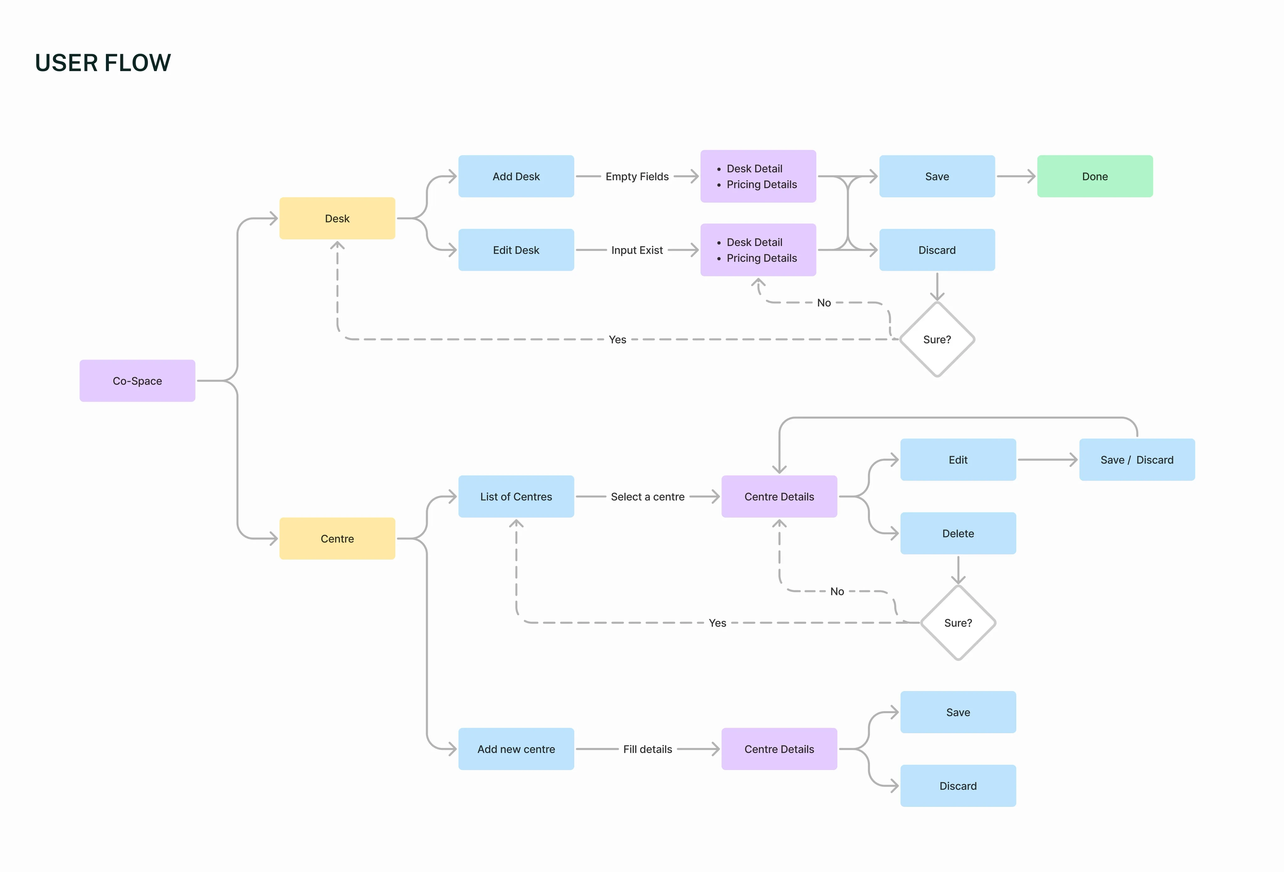
User Flow for Co-space Module
Design Process
1. Wireframing & Prototyping:
We started with low-fidelity wireframes to ensure that the basic structure and flow met user needs. Based on user feedback, we iterated on the designs before moving into high-fidelity prototypes.
2. Visual Design:
The visual design focused on clarity, simplicity, and a professional look that aligns with modern corporate environments. The color scheme was kept neutral to reduce cognitive load and enhance focus.
3. User Testing:
We conducted A/B testing with a group of 10 participants, and 90% of users found the new interface easier to navigate.
illustrating how the design matured
Wireframing
prototypes
Visual Design
User Testing
Key Features
Before
The key features were not highlighted in a structured way.
The key features were not highlighted in a structured way.
Now
1. Improved Navigation
A revamped navigation system that places the most-used features within one click.
2. Simplified Booking
The booking process was reduced from 5 steps to 3, resulting in a 40% faster completion time.
3. Real-Time Notifications
Users now receive instant notifications for workspace availability, improving response times.
4. Customizable Dashboards
Admins can now personalize their dashboard view, leading to better workspace management.


Old Hi-fi wireframe.
Final Results
• Task completion time was reduced by 35%.
• User satisfaction improved by 50%, based on post-redesign surveys.
• Workspace booking errors dropped by 20%.
• Task completion time was reduced by 35%.
• User satisfaction improved by 50%, based on post-redesign surveys.
• Workspace booking errors dropped by 20%.
Conclusion
Before
The conclusion lacked a professional summary.
The conclusion lacked a professional summary.
Now
The redesigned workspace management dashboard exceeded client expectations by improving both efficiency and user satisfaction. By focusing on usability and modern design principles, we transformed the user experience into one that is intuitive, reliable, and scalable for future growth.
The redesigned workspace management dashboard exceeded client expectations by improving both efficiency and user satisfaction. By focusing on usability and modern design principles, we transformed the user experience into one that is intuitive, reliable, and scalable for future growth.


New - Hi-fi wireframe.
Explore next


Ein Produkt von
Erhalte eine Benachrichtigung, wenn ich neue Blogbeiträge veröffentliche


1,1k+ andere Abonnenten
Alle Rechte vorbehalten © 2024 Fadi Hakim
Ein Produkt von
Erhalte eine Benachrichtigung, wenn ich neue Blogbeiträge veröffentliche
1,1k+ andere Abonnenten
Alle Rechte vorbehalten © 2024 Fadi Hakim
Ein Produkt von
Erhalte eine Benachrichtigung, wenn ich neue Blogbeiträge veröffentliche
1,1k+ andere Abonnenten
Alle Rechte vorbehalten © 2024 Fadi Hakim